Filipe Pires Alvarenga Fernandes
The IPython notebook demonstrate how to calculate and plot the mixing percentage of the three major water masses from the South Atlantic.
The data used is freely available, and consist of temperature and salinity downloaded from the World Ocean Atlas 2009.
The mixing percentage of each water mass is obtained by solving a linear system of equations where we have 3 unknowns and three equations according to Mamayev (1975):
\(m_1T_1 + m_2T_2 + m_3T_3 = T\)
\(m_1S_1 + m_2S_2 + m_3S_3 = S\)
\(m_1 + m_2 + m_3 = 1\)
where, - \(T, S\) are the temperature and salinity data where we want to know the mixing rations; - \(T_n, S_n\) the temperature and salinity pairs for the water masses core 1, 2, and 3; - \(m_1, m_2, m_3\) the water mass mixing percentages we are looking for.
The water masses we will investigate are the: South Atlantic Central Water SACW formed in the center of the South Atlantic Subtropical Gyre; the Antarctic Intermediary Water AAIW formed in the Antarctic Convergence zone originated by upwelling the North Atlantic Deep Water NADW; and last but not least the NADW, which is formed across the Greenland-Iceland-Scotland Ridge. We could include more water masses in the analysis, for example: the Antarctic Bottom Water AABW and/or the Circumpolar Deep Water CDW. However, that would require two more equations, and therefore two more conservative properties. Temperature and Salinity are the easiest conservative variables to compute. Other variables like oxygen, silicate and etc could be used, but would require a special treatment to became quasi-conservative to be included in the analysis.
The contouring of the mixing percentages is a simple, yet powerful tool to understand mixing the ocean.
Caveat: The water masses cores used here were modified and may not correspond directly with the cores found in the literature. The reason for that was to show both the Tropical Water and the South Atlantic Central Water as one water mass.
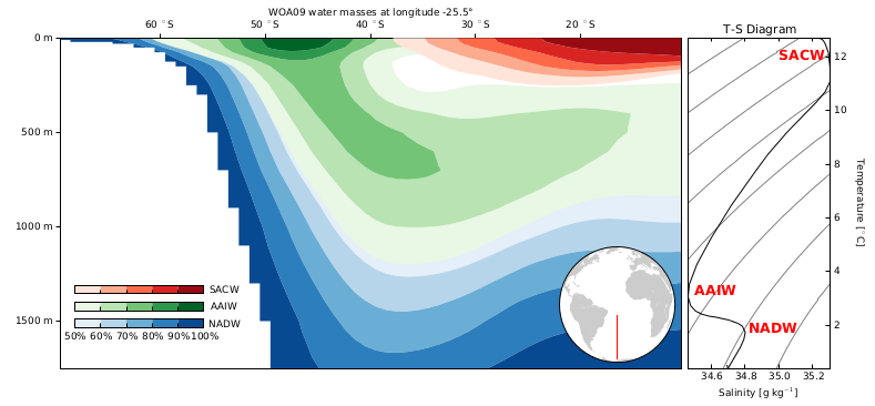
The figure: Matplotlib allows us to contour the results with three separated colormaps, facilitating the interpretation. A world map inset shows the transect (in red) of the data. In additional, we plot the Temperature-Salinity Diagram (T-S), to help visualize each the water mass center. The T-S diagram displays the seawater density (as gray contours) from lighter to heavier water (at the top and at the bottom of the figure respectively) and the meridional mean of the temperature and salinity.
interpretation: We can see that we have both AAIW and SACW cores (100%) in our domain. We can also note that, even though the SACW occupies the majority of the T-S diagram range, it is not the major water mass in our domain. Another important remark is that the NADW reaches from the North Atlantic all the way to the Antarctica, where it mixes with colder and fresher water to creates the AAIW. That is an important part to the global Conveyor Belt (or Thermohaline Circulation).
The “white” gap at bottom the contour represents the AABW and the CDW that are not resolved in our model. The overlap of the contour is an evidence of a poor choice for the water mass cores (probably bad choices for the water masses cores).


